Should a website provide configurable accessibility options to users?
Update about the used example in this post
Today (17th of June 2021) I stumbled upon a CSS Tricks article which states that you CAN detect if a user has their colours inverted system wide. Kicking over the whole foundation of the examples I provide in this post. The original problem that I had is thus solved (use the @media (inverted-colors) media query). If you still want to read the original post, let’s get going.
Today I did an interview for my accessibility research (in Dutch, Chrome translates it well). The person I spoke with used the system setting to invert all colours, due to hyper sensitivity to light. The result was that images were also inverted and thus became negative:
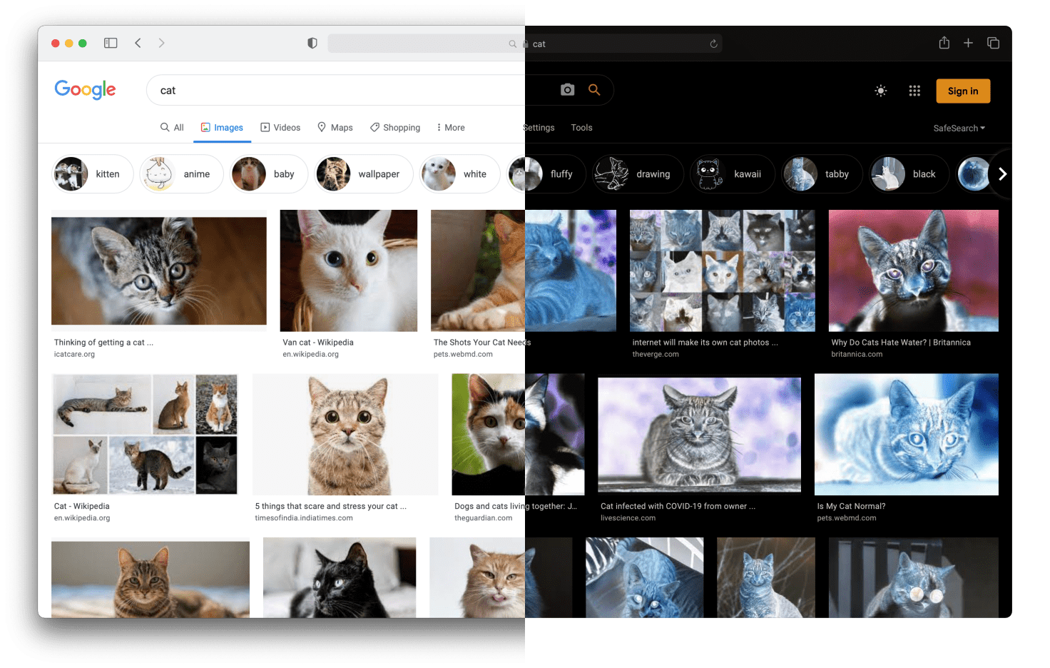
Here you can compare how inverted colours look on macOS. The left side shows a Google Images search without inverted colours. In the right side the colours are inverted. The images then become negatives. Making them really hard to interpret.
She uses social media on a regular basis. Seeing all images and videos in their negative form, takes the fun out of using it. When an image or video contains crucial information, it becomes a bigger problem.
On iOS there is the option to “smart invert” the colours. Meaning, all colours are inverted, except for images and video. That is the golden solution in this scenario, but I did not find similar “smart” colour invert options in macOS, Android or Windows.
As a developer, I can provide an option to invert the colours of an image first, and when the operating system inverts all the colours on screen, my inverted image is again inverted, making it appear normal again. Like this:
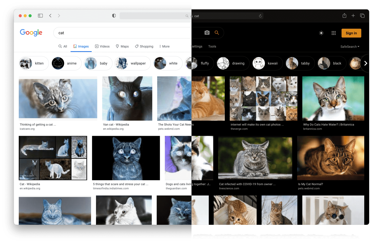
This time, an invert() filter is applied within the website itself. Again, the left side shows a ‘normal’ view but with inverted colours. The right side shows the inverted version. But because the images were already inverted, they appear normal again.
You can’t (rightfully) detect if accessibility features are enabled
The developer of a website can not find out if certain accessibility features are turned on or not. Not only are these settings handled system wide, from a privacy perspective a user might have good reasons not to disclose to every website they required these options.
If I want to allow the users to browse the site with inverted images, so that the operating system can reinvent them, I need to provide a UI for that. A accessibility settings menu if you will. That in turn requires the user to a) find it, and b) actively turn it on.
Questions to answer
All this considered, I have a couple of questions to answer:
Do users want this level of customisation?
I get fed up with all the cookie consent notices for every single website. I can imagine someone does not want to search for settings on every single website they visit.
But for an app or a site you use every day, you might want to go through that trouble.
How does a user distinguish between this menu and other bad actors?
Looking at the Overlay Factsheet, other attempts to ‘fix accessibility’ are not that well received. Although I don’t think this menu is comparable to these tools, It is vital that a user understands that as well.
How do I make sure that this does not become a tracking data point?
You don’t want to reapply the same setting every time you visit a site or app. Persisting the setting for the user is important. But that will (potentially) allow others to find out these settings have been set. Which violates the users privacy.
Do you have any answers?
Did I overlook important details? Are there existing solutions out there? Do you have an other opinion? I like to know about it!